Home
Reporting & Analytics
Advanced Reporting With Analytics
Flex Report
Flex Report

SERIES:

Flex Report

Learn how to use Everflow's Flex Report to build custom reports and analyze your data using flexible pivot tables that show exactly what you need.

Overview

The Flex Report gives you complete control over how you slice and dice your data. Think of it as building your own custom report from scratch - you pick exactly which columns you want to see and how you want to group everything together.

Here's what makes it powerful: while most reports limit you to one or two ways of looking at your data, the Flex Report lets you combine up to 10 different dimensions. Want to see performance by offer, partner, country, tracking domain, and the specific ADV values you're passing? No problem. Each row becomes a unique combination of all those elements, so you can spot patterns you'd never see otherwise.

It's especially useful when you're passing custom information through parameters like ADV1, ADV2, etc. Maybe you're running loan campaigns and passing debt amounts, or you're tracking user demographics like age ranges. The Flex Report lets you analyze all that custom data alongside your standard metrics.

Why Use It?

  • Complete Flexibility: Build reports that show exactly what you need to see
  • Deep Analysis: Group and break down data in multiple ways
  • Focus on What Matters: Use filters to look at specific parts of your data
  • Find Opportunities: Spot trends and patterns in your data
  • Better Decisions: Get clear insights to improve your marketing

Accessing The Report

Find and open the Flex Report in Everflow.
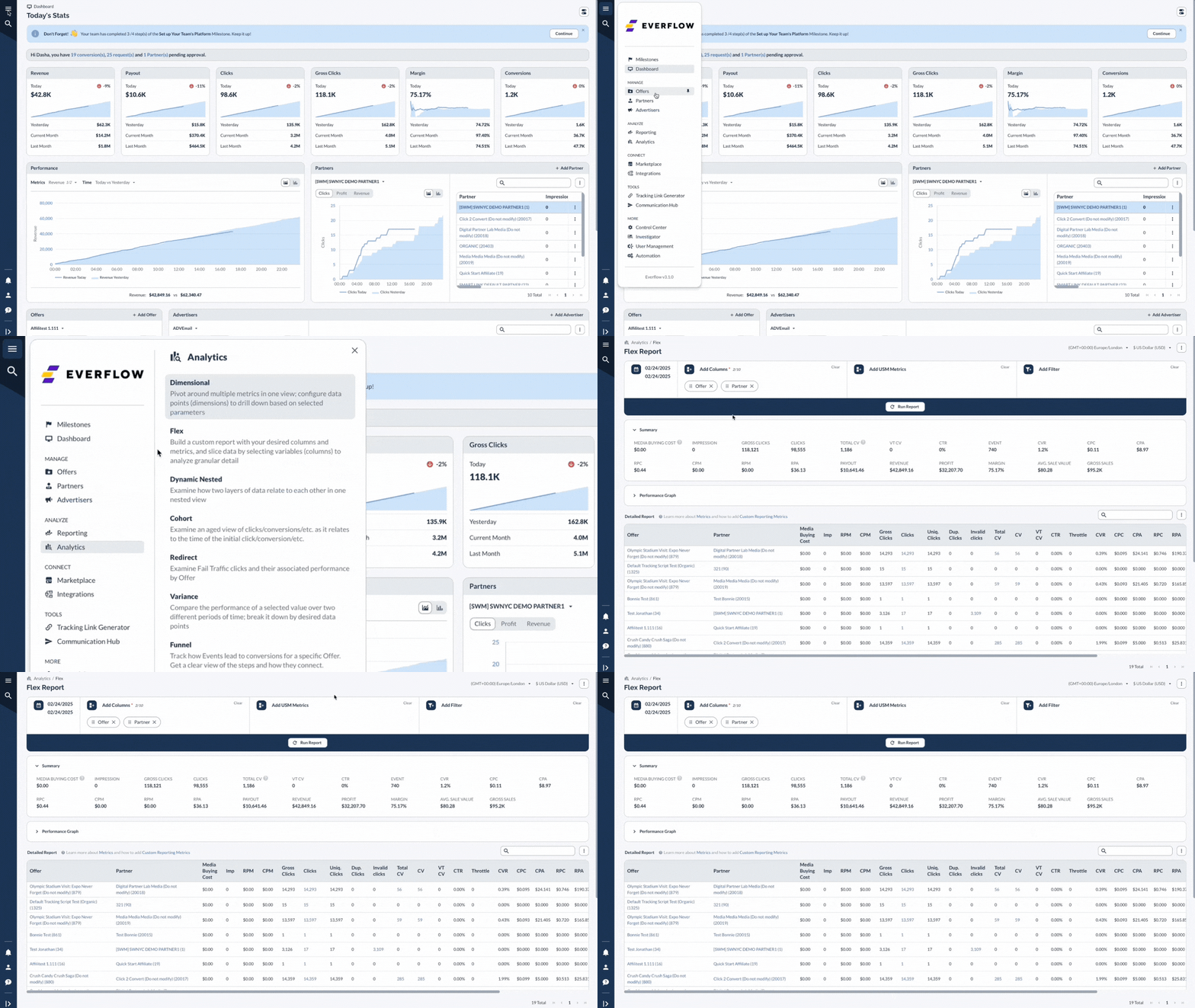
Go to the hamburger menu in the top left of your Everflow dashboard. Navigate to the Analytics section in the main menu. Select Flex from the reporting options.

Setting Up Your Report

Configure the columns and filters for your Flex Report.
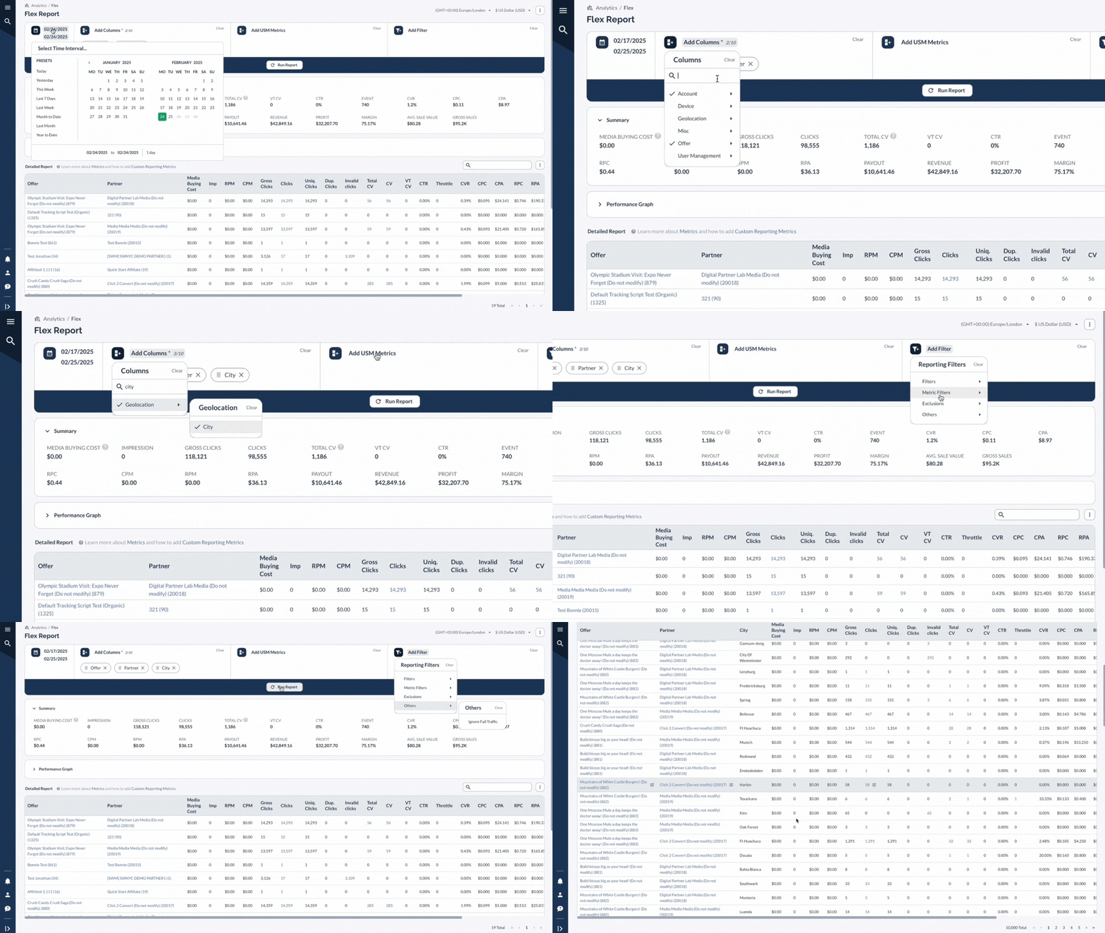
Click Add Columns button to select the data points you want to include in your report Choose from a wide range of options, such as Offer, Partner, Browser, City, and more Use the funnel icon to access all available filters in one convenient section Apply filters for dimensions like Offer, Partner, country, and more. Utilize Metric Filters to set thresholds (e.g., only show Offers with >1000 clicks) Combine multiple filters to create highly specific data views Click Run Report to update the report with your selected columns and filters

Interpreting The Results

Understand and analyze the data presented in the Flex Report.

The Flex Report presents data in a table format, each row representing a unique combination of the selected columns. This allows you to analyze performance at a granular level, identifying trends and patterns that might not be apparent in more aggregate views. Use the Detailed Report section to view performance metrics for each row Expand the Performance Graph to visualize trends over time Click on blue data points to drill down and access more detailed information

A Real-Life Example

Let's say you're running campaigns and want to understand exactly where your best traffic is coming from. You suspect there are patterns you're missing, but standard reports aren't giving you the full picture.

Set up your analysis Add columns for Offer, Partner, Country, and ADV1 (let's say you're passing age demographics) Include your key metrics: Clicks, Conversions, Revenue, and EPC Set your date range to the last 30 days What you might discover You could find that Partner A crushes it with the 25-34 age group in Canada but completely fails with the same demographic in the US. Or maybe you'll spot that certain offers perform amazingly well when specific partners target users in particular cities - insights you'd never catch in a standard offer or partner report.

The real power shows when you realize that one partner is passing "high income" in ADV1 and their traffic converts at 3x the rate of everyone else. Now you know exactly what type of traffic to ask other partners for.
Take action on your findings Ask your best-performing partners to focus more on the demographics and geos that work Share successful targeting combinations with underperforming partners Adjust your payouts based on the quality of specific traffic types Build new offers targeted specifically at your highest-converting audience segments

The Flex Report basically turns into your detective tool for finding those hidden golden combinations that make all the difference in your campaigns.

Good to Remember Key considerations and limitations when using the Flex Report. When using Metric Filters, the Summary section and Performance Graphs will be empty for the Flex Report and other reports that support metric filtering. CPA/RPA in Flex Reporting: If you separate the report by events, the event lines will not have an RPA or CPA calculated. If you leave the event name column out, RPA and CPA are calculated against the base conversion amount.

Advanced Features

Click Copy Link to Report in the hamburger menu to share the report with colleagues or bookmark it for quick access Select Show API Request to view the API call used to generate the report, which can be useful for custom integrations or troubleshooting Use the Save option to save your report configuration for future use Click Load to access previously saved report configurations Select Schedule Report to set up automated report generation and delivery Choose Request Report to submit a request for a custom report or analysis

Bottom Line

The Flex Report is like a super-powered pivot table that lets you add up to 10 different data points to analyze your performance. It's perfect when you need to get really specific with your data - like seeing how each offer performs by partner, country, and tracking domain all in one view.